
Paneless UX assessmentqademo.com
A simulated AI-agent test of QA Demo, a public demo storefront built for testing. Not human user research, and not a test of every feature of the site.
- findings
- 2
- positive observations
- 5
- simulated journeys
- 3
- evidence records
- 11
- Main observed issue
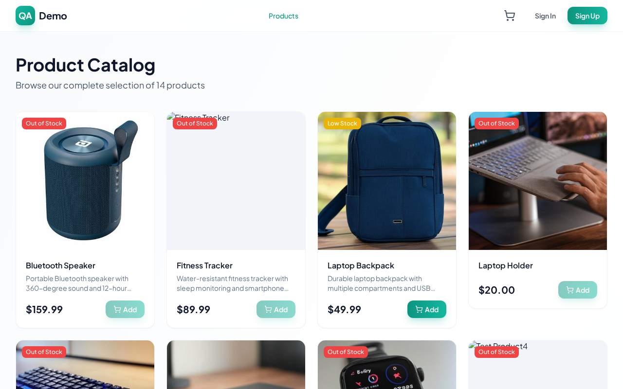
- Several catalog cards show broken or missing product images above their details.
- What worked
- Empty cart state clearly explains the current status and next step.
- First recommended action
- Fix broken catalog image rendering or replace failed product images with a stable fallback.
3 of 3 journeys completed; 0 terminated early. 3 of 3 selected personas produced reportable observations.
First-time visitor
Primary objectives achievedOffer is understandable, with catalog and cart clarity gaps
- Understand the offer and its intended audience
- Investigate a relevant safe journey and whether it matches the initial promise
Step 4 · Evidence 4
QA Demo is a captcha-free e-commerce testing platform for testers/devs; catalog, product, and cart evidence explain the offer and flow. No further safe visible step would clarify more—sign in/up is account-only and not needed for understanding the offer.
- Explore a specific offer or capabilityinvestigated
- Inspect relevant trust or support informationinapplicable
- Check clarity deeper in the journeyinvestigated
Impatient mobile user
Primary objectives achievedFast path to essential product information worked well
- Find essential information efficiently on the current viewport
- Follow a direct safe route to a relevant next step
Step 7 · Evidence 7
Current product page shows essential info (price, stock, shipping) and the next safe action (Add to Cart) with no further navigation needed.
- Inspect a substantive offer detailinvestigated
- Check whether useful support or terms are easy to reachincomplete
Non-technical customer
Primary objectives achievedPlain-language understanding improves after leaving the homepage
- Understand the offer in practical language
- Follow a relevant journey and understand the consequences of its next step
Step 11 · Evidence 11
A laptop backpack product page with an Add to Cart step; the footer says this is an e-commerce testing platform for automated testing where browser agents can add to cart and place orders.
- Inspect an example or capabilityinvestigated
- Explore an explanation of unfamiliar termsinapplicable
- Check relevant support informationinapplicable
Primary objectives describe recorded exploration, not a completed purchase, booking or submission.
Finding 1 · Low priority · 3/10
Several catalog cards show broken or missing product images above their details
Missing imagery weakens the catalog's realism and makes it harder to quickly scan representative products.
- Persona
- First-time visitor · observed in 1 of 3 simulated persona journeys
- Observed problem
- In the catalog view, some product cards display blank image areas or broken image rendering while the product name, stock badge, price, and Add button remain visible.
- Affected task
- A first-time visitor gets a less clear overview of what the catalog contains.
Evidence 2 · Viewport after action · scroll 0px · qademo.com/catalog Finding 2 · Low priority · 3/10
Catalog cards cut off product descriptions before the practical meaning is visible
Without enough visible description, the visitor has to open products to learn basic practical details.
- Persona
- Non-technical customer · observed in 1 of 3 simulated persona journeys
- Observed problem
- Multiple product cards truncate description text with ellipses, such as “Portable Bluetooth speaker with 360-degree sound and 12-hour...” and “Durable laptop backpack with multiple compartments and USB...”.
- Affected task
- Less plain-language context about what each item does before selecting one.
Evidence 9 · Viewport after action · scroll 0px · qademo.com/catalog
What worked well · 5
Empty cart state clearly explains the current status and next step “Your cart is empty” with supporting text and a visible “Continue Shopping” button.
Evidence 4Catalog exposes scannable product cards with price and stock cues Names, prices, “Low Stock” / “Out of Stock” labels and add buttons above the fold.
Evidence 6Product page surfaces key purchase information immediately The Laptop Backpack page shows name, price, stock, short description, shipping notes and a large “Add to Cart” button in the initial view.
Evidence 3, 7, 10Homepage provides a clear primary next step A prominent “Browse Products” button under the intro.
Evidence 6, 9Footer states the site is for testing purposes
Evidence 11
Screenshots shown: the 2 originals captured in this report. The other evidence records are referenced by number.
- Low priority · 3/10Finding 1 · Evidence 2
Fix broken catalog image rendering or replace failed product images with a stable fallback
On /catalog, repair the product-card image rendering path or provide a consistent fallback image/state when an image cannot load.
Verification Repeat the cited journey steps and confirm the issue no longer occurs and the task can continue.
- Low priority · 3/10Finding 2 · Evidence 9
Show more of each catalog card description before truncation
Make one more line visible, or rewrite the preview copy so the most concrete product meaning appears before truncation.
Verification Repeat the cited journey steps and confirm the issue no longer occurs and the task can continue.
Suggested changes have not been tested. Findings ordered by final finding severity.